No technical analysis in forex is possible without a chart because that is often the first thing we view whenever we study the markets. Whether a rare flash crash occurred or a big news release occurred, charts are our first reference point every time.
Traders are littered with several different kinds of charts serving contrasting functions, from line, bar, Japanese to Renko and Heiken Ashi.
The three most popular chart types
In forex, there are three popular chart types the average trader has some knowledge of.
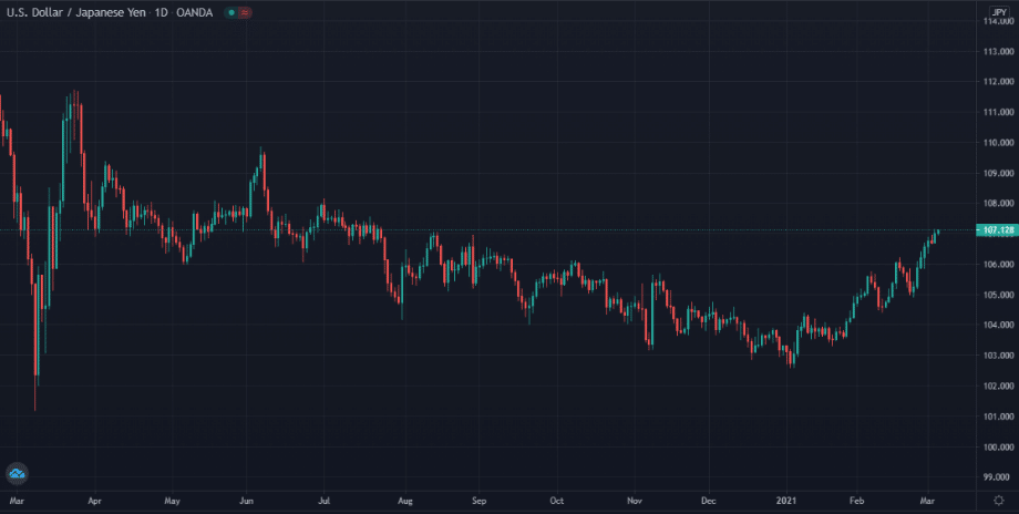
Japanese candlesticks
This chart type creation is often attributed to Munehisa Homma, the 1700s Japanese rice trader Japanese. The candlesticks have, over the years, spawned somewhat of a movement of price action trading using patterns that are the invention of those like Homma back in their day.
They are generally the cornerstone of all technical analysis in forex. These candlesticks are among the most dynamic and visually aesthetic as each candle presents us with four critical pieces of information about a particular market session; the high, low, open, and close price.
Depending on the trading platform, traders will typically use two colors like red to signify a bearish candle and green to represent a bullish one, giving a straightforward illustration of the dominance between buyers and sellers.
Aside from this data, specific patterns such as pin bars and engulfing candles also tell their story in ways that other charts can’t.
Bar charts
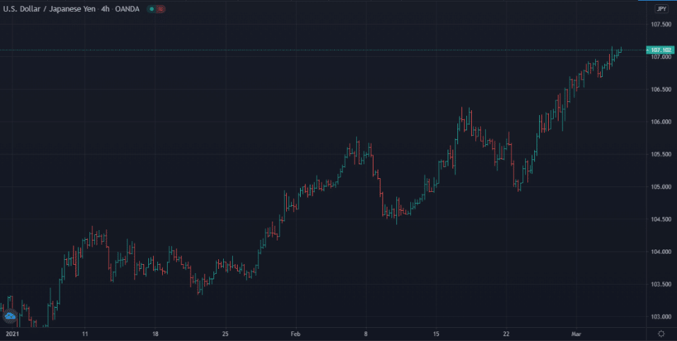
Bar or tick charts are essentially Japanese candlesticks without the bodies as they also represent all four components of price. The chart consists of vertical lines, and like its counterpart, offers a dynamic representation of the market.
Line chart
This chart works and looks similar to a line graph by plotting where the market moved from one price to another (unlike Japanese candlesticks that also consider the open, high and low).
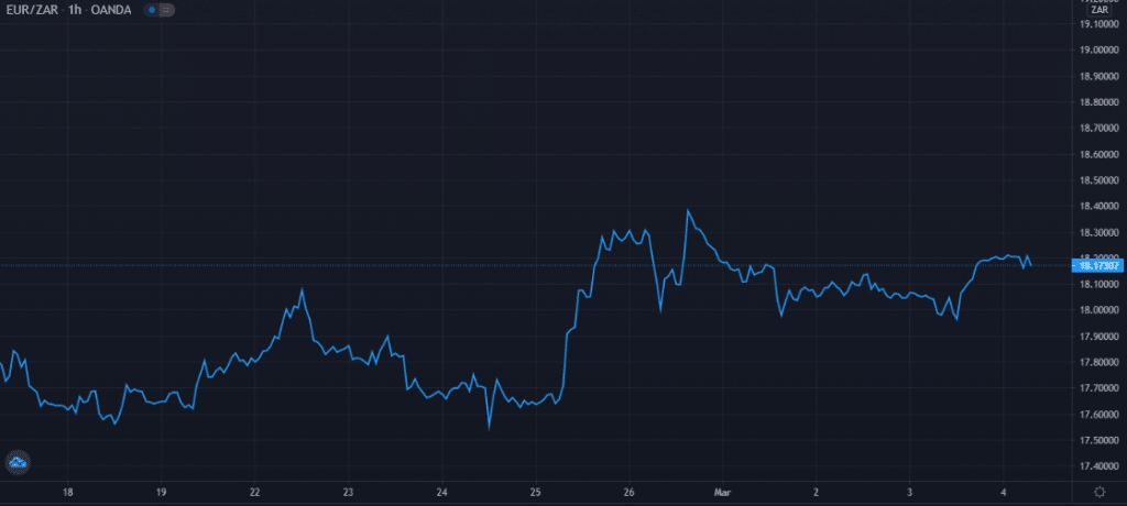
Although line charts only consider the opening and closing prices, when zoomed out, they give a much smoother representation of trends without any candlestick wicks. Many traders often consider the closing price as the most important of them all, which is why they may occasionally prefer line charts.
Other less popular chart types
We have other more obscure chart types that a dedicated number of traders prefer. Unfortunately, some platforms (most commonly, MetaTrader 4) do not include these as options, meaning they need to do a thorough search for them with different software packages.
Renko
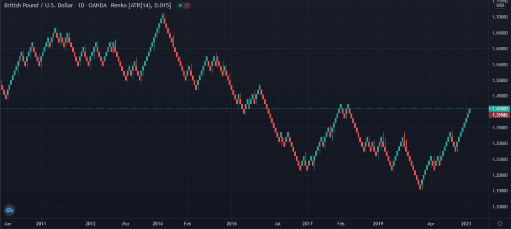
These charts depict price movements using a series of 45-degree angled blocks or ‘bricks.’ The theory is that the word, Renko, is taken from the Japanese word, renga (translated in English, it means bricks).
What is somewhat unusual yet unique about these charts is they only consider the price direction rather than set time intervals. Therefore, the time for forming a new block is not fixed, though each one will always be the same size.
Depending on the software, traders set the number of pips they desire for the blocks to form. Traders use Renko charts to filter to the ‘noise’ or random price movements that Japanese candlesticks typically depict.
Viewers receive a cleaner and more streamlined view of trends in the markets. If a trader is used to regular time sessions, Renko is useless for them. They also filter out too much crucial information the higher in time frame one goes.
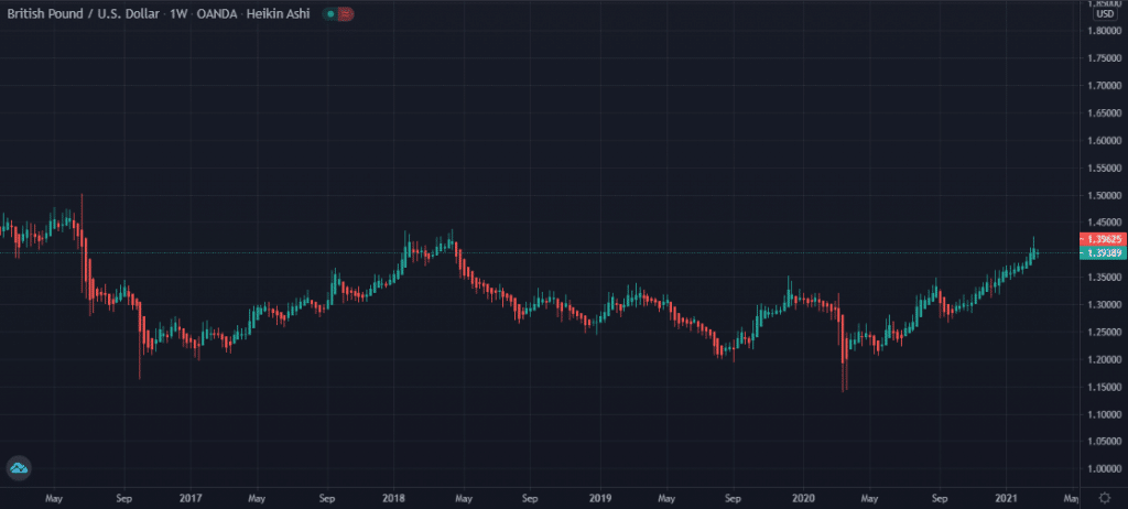
Heiken Ashi
Yet another invention from Japan, Heiken Ashi charts are more like a stripped-down version of candlesticks. The term, Heiken Ashi, means ‘average bar’ in the Japanese language.
These charts also depict the open, high, low, and closing (OHLC) prices of an instrument, except that there is a special formula for calculating this data (part of which includes the closing price being the average of the OHLC as a whole).
Heiken Ashi also aims to be a noise-filtering chart, helping traders to see the ‘naked’ trend without many candlestick wicks or shadows. With a normal candlestick chart, in an uptrend, you will typically see a balanced mix of both bearish and bullish candles while still observing an upward trajectory.
With Heiken Ashi, you will observe very few ‘red’ candles in the same trend and an overwhelming majority of bullish ones, which is how it filters the noise.
Some traders note that Heiken Ashi can better identify strong bull or bear markets than some of their counterparts. They will naturally use these charts to decipher whether to stay in trends and how likely they will persist.
Does it matter which type of charts you use?
Ultimately, it doesn’t matter greatly the chart a trader typically uses, though some do offer other benefits not found in others. A trader may choose to switch between two at any given time.
For example, they could use a Heikin Ashi chart to clearly see the trend and revert back to the Japanese candlesticks for better pricing data and entry points. Any chart must allow one to analyze trends, potential reversals, and other aspects of price movements like volatility and momentum within a trading session in a visually pleasing and simple way.
Japanese candlesticks offer significant advantages over other charts, not just aesthetically, but they are the best at signifying price action and its unique dynamics.
Hence, they will continue to be the most preferred in the markets by many traders, despite falling short in a few areas nonetheless. Most traders will agree Heiken Ashi candles are the second-best in most aspects.
Conclusion
Without charts, we wouldn’t have any visual representation of either historical or present price movements. While this article only scratches the surface of what is available, the five above are the most common anyone will see.
It’s hard to dispute the overwhelming prevalence of the Japanese candlesticks both for their dynamism and visual appeal. Some traders may find an edge with something like a Heiken Ashi or line chart if they can exploit a unique attribute not found in other charts.


